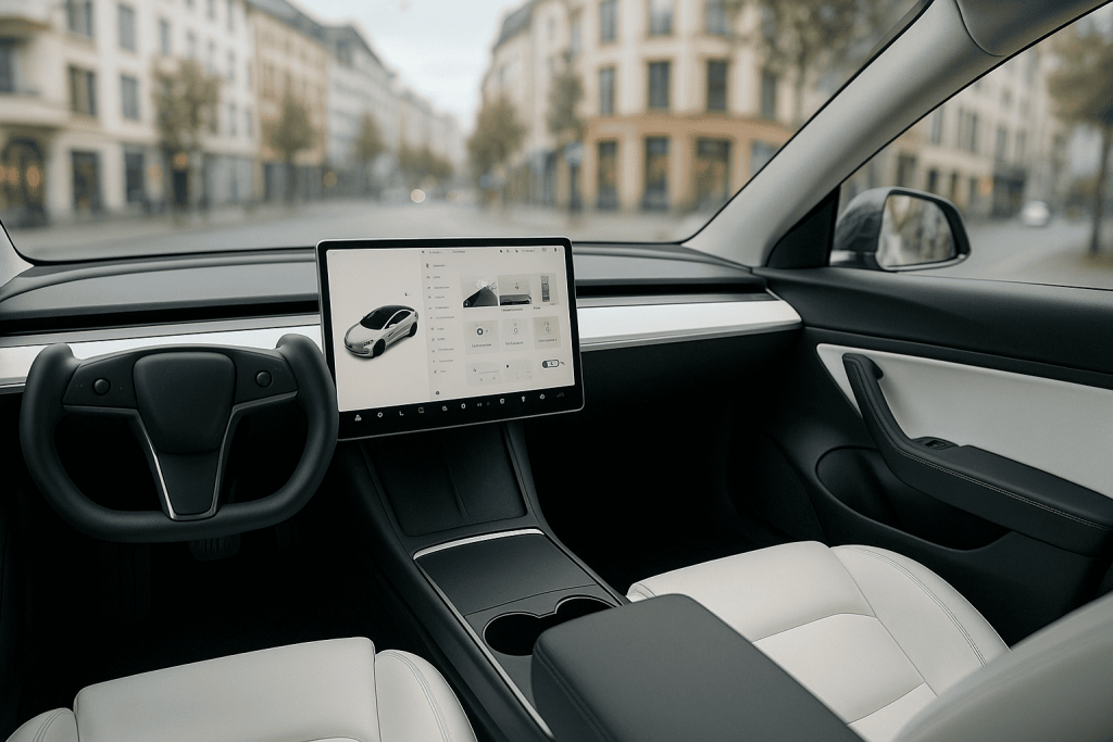
Tesla’s interiors divide opinion. For fans, the clean dashboard and single central screen feel futuristic, calm, and software-first. For skeptics, the absence of physical buttons risks distraction, especially when the driver must hunt through menus for routine tasks. This article looks past tastes to examine how Tesla’s minimalist UX affects ergonomics, safety, learning curves, and day-to-day usability—where it shines, where it stumbles, and how to adapt.
Why Tesla Went Minimal
Minimalism is not only an aesthetic choice. Fewer physical controls mean fewer parts, simpler manufacturing, and a cockpit that can evolve via software. Interfaces migrate from hardware into code, letting Tesla roll out features, reorganize menus, and refine workflows after delivery. This “software-defined cockpit” also standardizes the experience across models, reducing driver re-learning when switching vehicles.
Ergonomic Upside: Clarity, Consistency, Calm
With most functions consolidated into a single, high-contrast display, Tesla reduces the “control scatter” that plagues busy dashboards. Clear typography, large targets, and consistent iconography cut visual clutter. A calm cabin can lower cognitive load: fewer competing lights, no forests of switches, and less brand-driven ornament. For many drivers, navigation, media, and climate live in predictable screen regions they memorize quickly, creating reliable muscle memory—just digital instead of physical.
Ergonomic Downside: Glance Time and Mode Switching
Physical buttons allow “eyes-off” confirmation through haptics and position memory. A flat screen lacks tactile landmarks; if a control is nested or relocates after an update, glance time grows. Tasks that should be “set and forget” (seat heaters, wiper speed, air-direction tweaks) can demand visual attention if buried one tap too deep. Mode switching—shifting mental context from driving to menu navigation—becomes the core risk of any screen-heavy cockpit.
What Tesla Gets Right in UX
Common, high-frequency actions are anchored near the driver’s reach zone: climate sliders, seat heaters, defog/defrost, mirrors and steering adjustments, and quick-access cards for wipers or cameras. Voice commands cover many tasks—destination entry, temperature, seat heaters, and media—reducing manual interaction. Persistent status areas (speed, gear, indicator feedback) remain in fixed positions, and contextual cards pop up when relevant (e.g., wiper control in rain, charger controls at a station).
Where Minimalism Bites
Low-frequency but time-critical actions (e.g., adjusting wiper speed during a sudden spray, changing following distance in heavy traffic) can feel one step away. Seasonal toggles—rear fog lights, heated steering—may hide behind submenus. Over-the-air updates that relocate tiles or alter iconography can nudge drivers back into a discovery phase, increasing cognitive load—especially if the change happens right before a long trip or in poor weather.
Safety & Human Factors: Practical Considerations
Good HMI (human–machine interface) minimizes off-road glance duration and limits interaction steps at speed. Practical habits help: set cabin temperature, mirror/seat position, and driver profile before moving; pin most-used tiles to quick access; rely on voice for transient tasks. On the hardware side, steering-wheel scrolls and thumbwheels offer “analog islands” for volume, cruise spacing, and speed—small but crucial redundancies that reduce screen dependence during busy driving.
Voice as a Primary Control
In a button-sparse cabin, strong voice recognition is a safety valve. Natural phrasing—“set temperature to 21,” “turn on rear defrost,” “navigate to home”—keeps eyes forward. Voice, however, isn’t perfect in every accent, language, or noisy cabin. The best practice is hybrid: use voice for quick one-shot tasks, and reserve the screen for rare settings changes when stationary.
Gloves, Cold, and Wet Weather
Capacitive screens and winter gloves don’t mix well. Workarounds include glove-friendly tips and leaning on voice and steering-wheel controls. Preconditioning helps: set heated seats, wheel, and defrost before departure while the vehicle is plugged in, so fewer screen interactions are needed on the move. Keep a simple “winter quick card” on the home view with wipers, defrost, and mirror heat.
Learning Curve: From Discovery to Mastery
New owners pass through three phases. Discovery: tapping through menus, trying voice, and customizing quick access. Routine: building a weekly flow—navigation favorites, commute climate presets, charger workflows. Mastery: eyes-off habits using the wheel controls and voice for 80–90% of interactions. Tesla’s UX works best once personal shortcuts are set and seldom moved.
Family & Passenger Usability
Minimalism can be a win for families. The flat floor and open front row free space for bags; the screen becomes the control hub anyone can understand. Kid-friendly features—cabin overheat protection, sentry and dashcam, easy profile switching—are software toggles away. The flip side: children tapping screens can change settings. Use profile locks, child locks, and pin-to-drive where appropriate.
Serviceability and Updates
Because controls are software, fixes and refinements arrive over the air—no dealer trips for a sticky button. But updates should respect “don’t move my cheese” principles: preserve core muscle memory, label new features clearly, and allow users to re-pin controls. Owners can schedule updates at home, then take a short familiarization drive around the block to re-cement muscle memory before a long trip.
Accessibility & Inclusion
Large fonts, high contrast, and clean layouts aid many users. To improve inclusivity, screen readers, color-blind-safe palettes, and customizable tile sizes help. For drivers with limited dexterity, voice and large on-screen targets reduce strain; for those sensitive to motion, limit animated transitions. Minimalism should not equal minimal accessibility—configurability is key.
Best-Practice Setup for a “Buttonless” Tesla
• Create driver profiles for each regular driver (seat, mirrors, steering, climate).
* Pin a quick-access bar: wipers, rear/defrost, heated wheel, seat heaters, dashcam, camera, and a favorite app (nav or energy).
* Add navigation favorites (home, work, frequent stops) and enable calendar sync for one-tap routing.
* Train voice for temperature, seat heaters, defrost, media, and navigation.
* Precondition routinely; rely on scheduled departure for warm battery and clear glass.
* After OTA updates, re-check your pinned tiles and do a short practice run.
Minimalism vs. Habit: A Balanced Verdict
Tesla’s design trades tactile redundancy for software flexibility. Done well, it yields a calm cockpit and rapid iteration. The cost is a steeper learning curve and potential glance-time spikes if key functions move or hide. The most successful owners treat setup as part of delivery: pin essentials, practice voice, and keep a stable set of routines. With that, Tesla’s “buttonless” philosophy can be both elegant and usable—minimalism that serves the drive, not just the brochure.
Conclusion
Tesla’s UX proves a modern cabin can prioritize software without collapsing ergonomics—if drivers pair minimal hardware with smart defaults, voice control, and consistent layouts. The approach won’t please every traditionalist, and it demands discipline from both the automaker (stable patterns) and the owner (thoughtful setup). But once mastered, the buttonless cockpit becomes quiet, predictable, and efficient—minimalism that earns its keep on every commute.